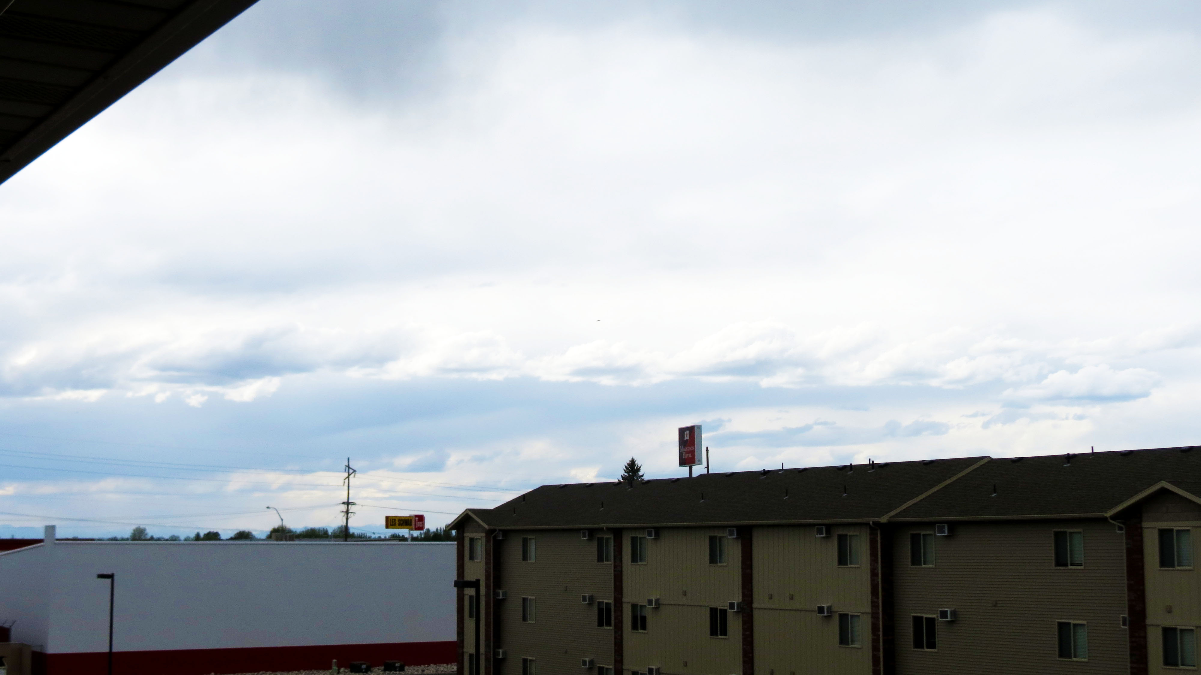
Portfolio


  • Portfolio (Scribd.com)
  • Project Corrections / Time spent: Too long, a few hours.
  • Message: I wanted to see what I was capable of.
  • Audience: Whoever is interesting.
  • Top Thing Learned:  I learned so much, but the Adobe Suite was most useful.
  • Future application of Visual Media:  Just about anything
  • Color scheme and color names:   Monochrome black and white with a brick accent color.
  • Title Font Name & Category: Trajan Pro, Old Style
  • Copy Font Name & Category:  Ariel, Sans
  • Thumbnails of Images used: There are tons

Project 8: The Brochure

Project4 Project3 Project2 Project


  • Description:  This is my favorite piece I have done, this is my masterpiece.
  • Process (Programs, Tools, Skills):  Oh wow, so much.  I used Illustrator, Photoshop, In Design, etc.
  • Message:  I wanted to do something that could be used.
  • Audience:  I want my audience to be anyone that would be interested in students for liberty literature.
  • Top Thing Learned:  I learned so much here.  I don’t even know where to start.  I learned about folds, alignment, brochure layout, the importance of In Design guidelines, etc.
  • Color scheme and color names:  I used black and white monochrome with a yellow accent contrast color.
  • Title Font Name & Category:  I used Ariel Black Sans
  • Copy Font Name & Category:  I used Tragen 3 old-style
  • Word Count of copy:  300ish
  • Thumbnails of Images used: ISFLC14_FB-cover_draft04 American-Constitution-640x290 operation fff-panel
  • Sources http://news.ucdavis.edu/photos_images/dateline_images/2013/091713/we_the_people_W2.jpg and the rest came from StudentsForLiberty.org


Project 7: John learns to code and the world opens to him.

Capture


    • Description:   I have created a functioning, if not a little 2002, website from scratch.
    • Process (Programs, Tools, Skills): I used HTML and CSS.  It  was a blast.  I also used a bit of adobe here and there for the images, but I coded the entire thing myself.
    • Message:  The site if for politicians who want to use my consulting services.  I don’t have a website yet and I will hire someone to do mine, but now I know the level of difficulty.
    • Audience: 
    • Top Thing Learned:
    • Color scheme and color hex:  I have used the same color scheme for most of my projects to make them all look like a set.  I like monochrome with a brick contrast color.  It looks very clean and crisp.
    • Title Font Families & Category:  I used “Palatino Linotype”, “Book Antiqua”, Palatino, serif
    • Copy Font Families & Category: “Times New Roman”, Georgia, sans-serif
    • Changes made to the CSS:  I changed the font, colors, and an accent line.  I also made the F from my logo image a tiled background.


Project 6: Card and Stationary

p6JohnFaust

p6JohnFaust2


  • Description:  This was a business card and stationary set.  I wanted to use the CF design I built in a different way.  I am not sure if I like the new logo more.
  • Process (Programs, Tools, Skills):  I used illustrator again, but this time in combination with indesign to create something of a hybrid project.  I began with my other logos and decided to design a new one with elements from last week.  I had a lot of fun putting together a cohesive plan for multiple products with a theme.   Illustrator was fascinating in it’s vector based graphics.
  • Message:  I wanted to make sure that the project felt professional and yet, out of the ordinary.
  • Audience:  I want my audience to be like minded politicians and businesses.  I believe in liberty.
  • Top Thing Learned:  I learned about effective business cards and how to create a theme and film.
  • Color scheme and color names:  Monochrome black and white with a Brick accent/contrast color.
  • Title Font Name & Category:  Trajen Old Style
  • Accent Font Name & Category:  Brush Script/decorative


Project 5, My Logo

Logo-page-001


  • Description:  These are my top 4 logos.  The top is very similar to the far right with different alignment.  I didn’t want to use 2 of essentially the same logo, but the alignment matters enough for me to add it.  The bottom 2 are took the most time.  I wanted to make sure that the F looked good while making sure that it kept with the theme.
  • Process (Programs, Tools, Skills): Adobe Illustrator is a fantastic tool.  Once I figured out how it did it’s math, it became the easiest so far.  I then polled 10 people on which logo they liked the best.  From there it was determined that the top was the best but 3 people said I should look at how I aligned the text.  That is why I added the new alignment and re-polled 5 people.  $ liked the new alignment over the old.  I have included all 4 in this post to show the evolution of my logo.
  • Message:  The message of my logo is one of professionalism with character and individuality.
  • Audience:  My consulting company works with politicians to shore up their online presence and reputation.
  • Top Thing Learned: I learned how to use illustrator’s vector based graphics with my affinity for math and geometry.
  • Three Color Scheme and Color Names:   Brick and Black
  • Three sets of Title / Body Font Names & Categories:  It is difficult, because I started with a font and then I changed it in illustrator for the top and far right.  I used raliegh which is oldstyle for a lot of it as well.
  • Votes on favorite logo: 2 polls were done 10 were asked about the 3 on the left and another 5 to determine if the alignment would be better with my changes. I used brush which is decorative/script as well as
  • Top Logo = 5-1; Middle Logo = 3 ; Bottom Logo = 2 ; Right Side Logo = N/A- 4;
  • My favorite logo is the middle on the left.  I worked really hard to get the symbol to look the way I wanted it.  That said, I will choose the far right for actual use.


Project 4: I’ll make ’em a montage they can’t refuse

Image


  • Description:  I was thinking about powerful moments in media for me and I thought about how much I admired Don Corleone.  I knew that I wanted to do one of my projects on The Godfather and what made Vito so interesting as a character.  I wanted to show Vito in both a light and dark light, as both wise family man as well as calculating and cold.
  • Process :  So, for this project I used Photoshop a lot.  I started learning about masking, shading, and composition.  I started with the original photo and my favorite quote and worked from there.  I found that quote in a similar way on another photo and wanted to incorporate some of those ideas into my project.  In the end, I had a really tough decision with the upper left corner; should it be the godfather logo emerging from the smoke or a hint of the iconic puppet hand in the background.  I went with the hand in the end and I still find myself switching between the two.
  • Message:  The message of this project has to do with power, corruption, and government.  Vito provided a service at a time that the police would not.  He offered protection and funding for businesses that he considered harmless vices (liquor, prostitution, and gambling).  Since no one else would protect these businesses, a wise and savvy businessman filled the void.  In a very real way, Vito and the mafia in general is a direct result of bad government policy and foresight.
  • Audience:  My audience would be people open to the idea that possibly our government can create bad policies with good intentions that have unintended consequences.  Those are the people that will understand it’s message.
  • Top Thing Learned:  The masking tool in Photoshop has become my friend.
  • Filter / Colorization used and where it was applied:  Masking was applied on the quotation marks, the quote itself, and the puppet hand.
  • Color scheme and color names: Black and white monochrome with a red contrasting accent color.
  • Title Font Name & Category: Times New Roman old style.
  • Copy Font Name & Category: Ariel sans
  • Thumbnails of Images used: Men_Male_Celebrity_Don_Corleone_Godfather_025942_
  • Sources (Links to images on original websites / with title of site): http://www.zastavki.com/eng/Men/Male_Celebrity/wallpaper-25942.htm


Junto Reading Group Poster: P3 Photodesign Project

JohnFaust.photodesign.jpg

  • Description: This is a flyer/poster for Junto.
  • Process (Programs, Tools, Skills):  I used Photoshop in conjunction with InDesign.  I wanted to use a color scheme in monochrome.
  • Message: I want people to come to Junto, a pro-liberty  reading group originally started by Ben Franklin.
  • Audience:  The audience this poster was designed for were the liberty conscious students who like to read at BYU.
  • Top Thing Learned:  I learned how to make a color scheme.
  • Color scheme and color names:  I used a brick monochrome.
  • Title Font Name & Category: Helvetica Sans
  • Copy Font Name & Category: Baskerville Oldstyle
  • Thumbnail of original, unedited image inserted.  JohnFaust6Inside (1)
  • Date and location you took the photo(s): Wednesday in my second room.


Photoshop Activity 3

JohnFaust06lightoutside

Light 1 – Outside

JohnFaust6Inside

Light 2- Inside

JohnFaust6foreground

Focus 1- Foreground

JohnFaust6Background

Focus 2- Background

JohnFaust6Ruleofthirds

Composition 1- Thirds

JohnFaust6leadroom

Composition 2- Lead Room

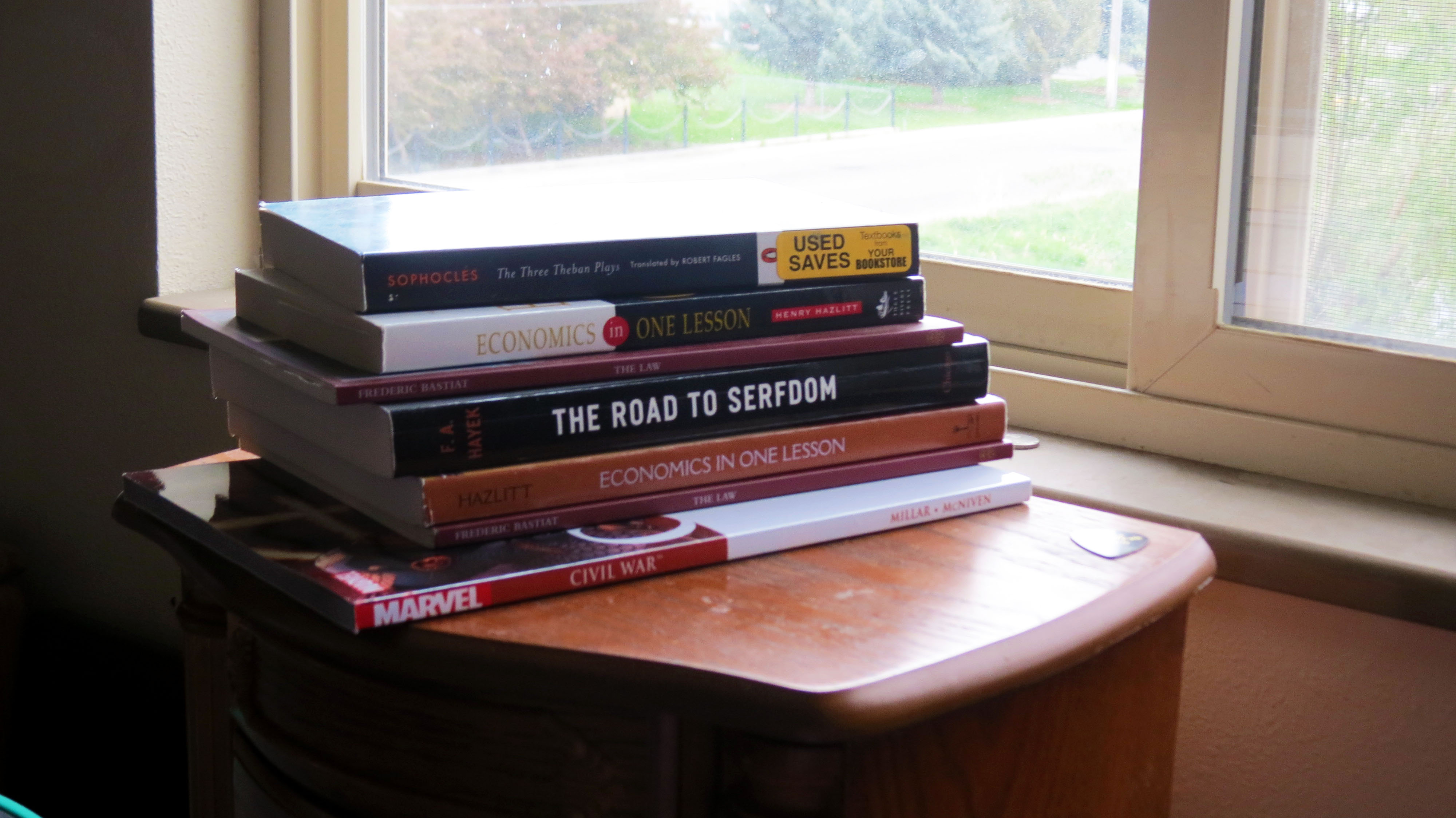
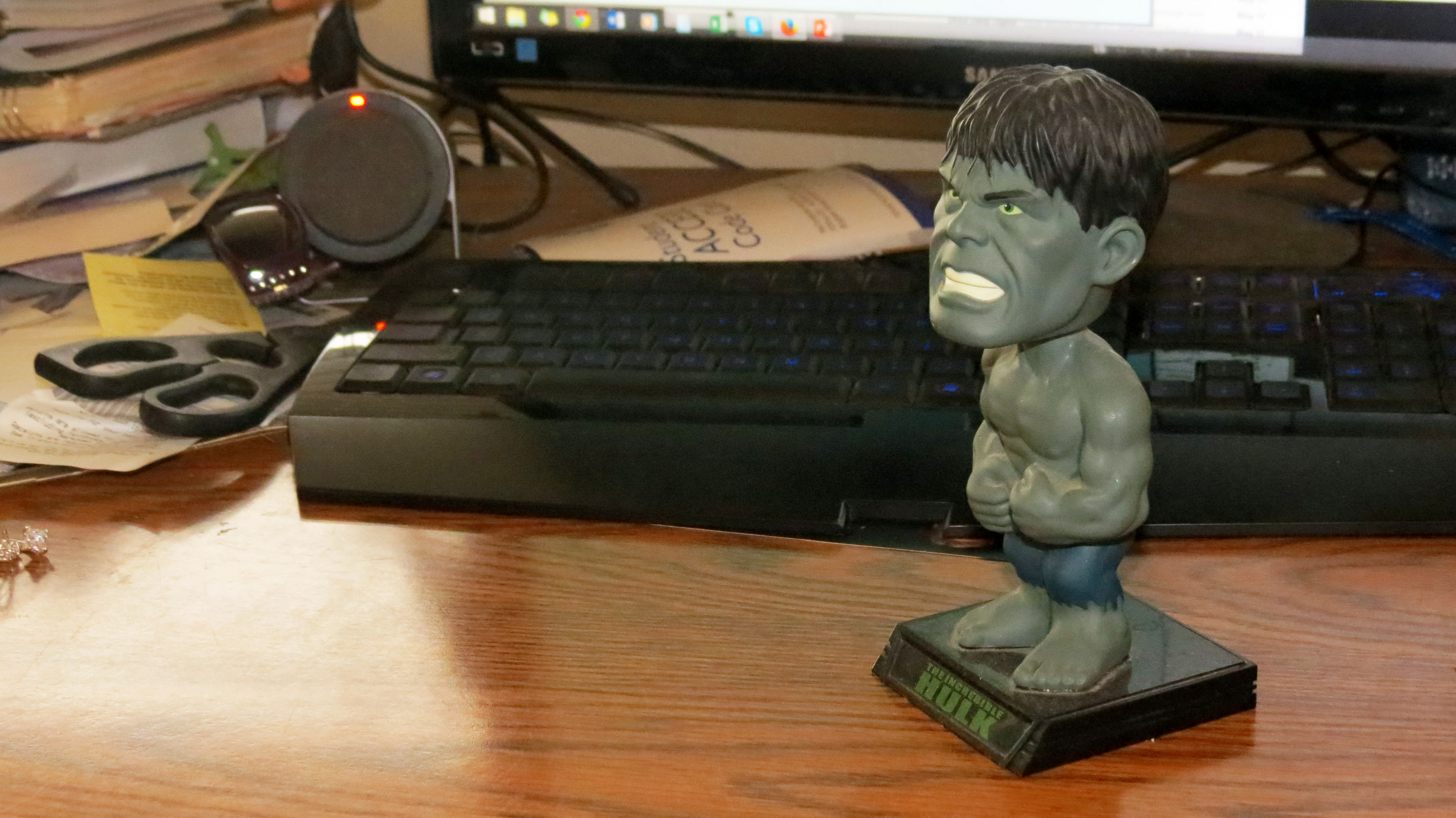
I really enjoyed working with PhotoShop and touching up these admittedly bland shots.  I wanted to learn how to pouch up real photos taken by someone who had little experience with photography.  My theory was, if I can make these look good, I can make any photo look good.  Also, who doesn’t love the bobblehead Hulk looking listless off into the distance.   I learned how to use many of the touchup tools available with Photoshop to sharpen, give contrast, brighten, as well as many other tools.  I will be investing in photoshop for my home computer because I enjoyed playing with the photos.  The pile of books was me trying to fit as much of my life in one photo as possible while making it interesting, colorful, and dynamic.

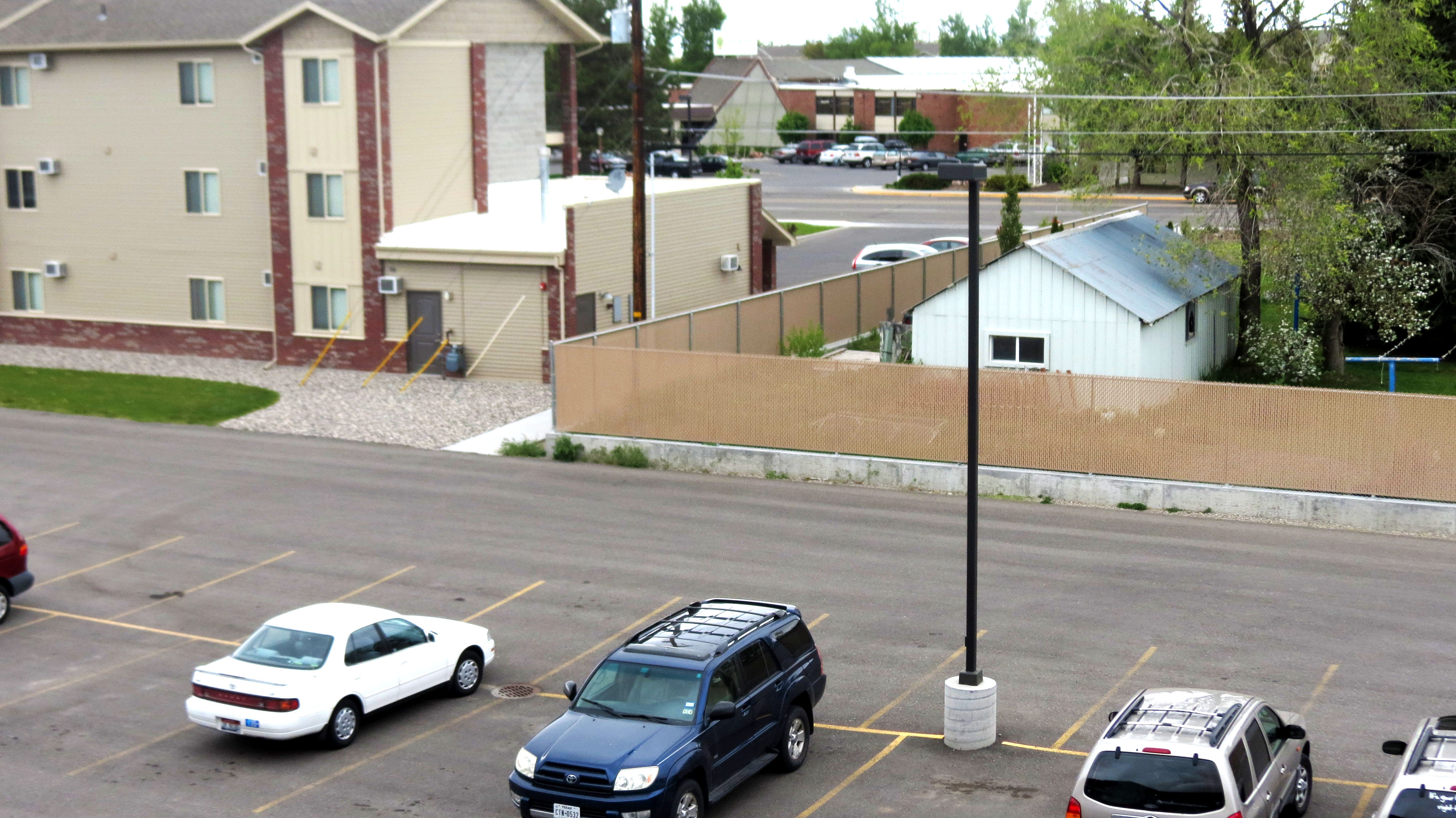
In many ways, these photos are my life.  That is my couch, my desk, the view from my balcony.  The more I touched up these photos, the more I really thought about what I really took photos of.  My apartment is kinda small and I made sure to get all of my favorite things.  What started as me being strapped for time on a rented camera, turned out to be something I really have a sentimental connection to.  After I began manipulating these shots I realized that it was important to make sure that the limitations of the camera didn’t distract from the way I know these objects should look.

And that is the story of how I learned to use Photoshop.

Project 2: My attempt at an SFL flyer

sfl flyer-page-001


  • Description: This is my first attempt at a flyer for SFL.  I used word because I will be able to change the dates and venues on the fly.
  • Process (Programs, Tools, Skills):  In this flyer, I really was able to explore what Microsoft Word is capable of in terms of design.
  • Message:  I wanted to use the popularity of the Assassin’s Creed franchise and it’s Libertarian leanings to design an SFL party around.
  • Audience:  My audience would be current and potential SFL members.  I want people to go, “I loved those games and liberty is important to me… this is perfect because I love food and women as well!  This is the perfect storm of the things I want out of leaving my house.”
  • Color scheme and color names:  I wanted to use an off-white for the background to give lots of negative space as well as a rugged red and blue motif that adds to the feel of the scan.
  • Top Thing Learned: I learned that Office can be used to do design work.
  • Title Font Name & Category:  Baskerville, Old Style
  • Accent Font Name & Category: Bradley Hand, Script
  • Scanned images used, sources, original sizes, location of scanner used: I used an image from Playstation Magazine Issue 062 on a library scanner.


Project 1, Visual Basic


My first attempt at Adobe In Design.


  • Description: A Flyer I made for a Graduate Leadership Conference.
  • Process (Programs, Tools, Skills):  Adobe In Design
  • Message: I wanted to make sure that everyone knew about the event and attended.  I wanted to make something visually striking.  I wanted the triangle motif to stand out in both positive and negative space.
  • Audience: Graduate students who need a leg up on the competition.
  • Top Thing Learned:  I have really been able to sink my teeth into Adobe InDesign.  That has been incredibly valuable to me.
  • Title Font Name & Category:  Sans Serif Futura
  • Copy Font Name & Category: Sans Serif Helvetica
  • Links to images used in this project: https://130.commbyui.org/wp-content/uploads/2013/01/JuliePeterson-Leadership-conference-business-rexburg-Idaho_7653-as-Smart-Object-11.jpg