Month: June 2014

Project 7: John learns to code and the world opens to him.

Capture


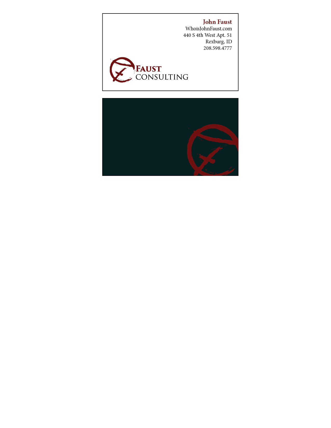
    • Description:   I have created a functioning, if not a little 2002, website from scratch.
    • Process (Programs, Tools, Skills): I used HTML and CSS.  It  was a blast.  I also used a bit of adobe here and there for the images, but I coded the entire thing myself.
    • Message:  The site if for politicians who want to use my consulting services.  I don’t have a website yet and I will hire someone to do mine, but now I know the level of difficulty.
    • Audience: 
    • Top Thing Learned:
    • Color scheme and color hex:  I have used the same color scheme for most of my projects to make them all look like a set.  I like monochrome with a brick contrast color.  It looks very clean and crisp.
    • Title Font Families & Category:  I used “Palatino Linotype”, “Book Antiqua”, Palatino, serif
    • Copy Font Families & Category: “Times New Roman”, Georgia, sans-serif
    • Changes made to the CSS:  I changed the font, colors, and an accent line.  I also made the F from my logo image a tiled background.


Project 6: Card and Stationary

p6JohnFaust

p6JohnFaust2


  • Description:  This was a business card and stationary set.  I wanted to use the CF design I built in a different way.  I am not sure if I like the new logo more.
  • Process (Programs, Tools, Skills):  I used illustrator again, but this time in combination with indesign to create something of a hybrid project.  I began with my other logos and decided to design a new one with elements from last week.  I had a lot of fun putting together a cohesive plan for multiple products with a theme.   Illustrator was fascinating in it’s vector based graphics.
  • Message:  I wanted to make sure that the project felt professional and yet, out of the ordinary.
  • Audience:  I want my audience to be like minded politicians and businesses.  I believe in liberty.
  • Top Thing Learned:  I learned about effective business cards and how to create a theme and film.
  • Color scheme and color names:  Monochrome black and white with a Brick accent/contrast color.
  • Title Font Name & Category:  Trajen Old Style
  • Accent Font Name & Category:  Brush Script/decorative


Project 5, My Logo

Logo-page-001


  • Description:  These are my top 4 logos.  The top is very similar to the far right with different alignment.  I didn’t want to use 2 of essentially the same logo, but the alignment matters enough for me to add it.  The bottom 2 are took the most time.  I wanted to make sure that the F looked good while making sure that it kept with the theme.
  • Process (Programs, Tools, Skills): Adobe Illustrator is a fantastic tool.  Once I figured out how it did it’s math, it became the easiest so far.  I then polled 10 people on which logo they liked the best.  From there it was determined that the top was the best but 3 people said I should look at how I aligned the text.  That is why I added the new alignment and re-polled 5 people.  $ liked the new alignment over the old.  I have included all 4 in this post to show the evolution of my logo.
  • Message:  The message of my logo is one of professionalism with character and individuality.
  • Audience:  My consulting company works with politicians to shore up their online presence and reputation.
  • Top Thing Learned: I learned how to use illustrator’s vector based graphics with my affinity for math and geometry.
  • Three Color Scheme and Color Names:   Brick and Black
  • Three sets of Title / Body Font Names & Categories:  It is difficult, because I started with a font and then I changed it in illustrator for the top and far right.  I used raliegh which is oldstyle for a lot of it as well.
  • Votes on favorite logo: 2 polls were done 10 were asked about the 3 on the left and another 5 to determine if the alignment would be better with my changes. I used brush which is decorative/script as well as
  • Top Logo = 5-1; Middle Logo = 3 ; Bottom Logo = 2 ; Right Side Logo = N/A- 4;
  • My favorite logo is the middle on the left.  I worked really hard to get the symbol to look the way I wanted it.  That said, I will choose the far right for actual use.


Project 4: I’ll make ’em a montage they can’t refuse

Image


  • Description:  I was thinking about powerful moments in media for me and I thought about how much I admired Don Corleone.  I knew that I wanted to do one of my projects on The Godfather and what made Vito so interesting as a character.  I wanted to show Vito in both a light and dark light, as both wise family man as well as calculating and cold.
  • Process :  So, for this project I used Photoshop a lot.  I started learning about masking, shading, and composition.  I started with the original photo and my favorite quote and worked from there.  I found that quote in a similar way on another photo and wanted to incorporate some of those ideas into my project.  In the end, I had a really tough decision with the upper left corner; should it be the godfather logo emerging from the smoke or a hint of the iconic puppet hand in the background.  I went with the hand in the end and I still find myself switching between the two.
  • Message:  The message of this project has to do with power, corruption, and government.  Vito provided a service at a time that the police would not.  He offered protection and funding for businesses that he considered harmless vices (liquor, prostitution, and gambling).  Since no one else would protect these businesses, a wise and savvy businessman filled the void.  In a very real way, Vito and the mafia in general is a direct result of bad government policy and foresight.
  • Audience:  My audience would be people open to the idea that possibly our government can create bad policies with good intentions that have unintended consequences.  Those are the people that will understand it’s message.
  • Top Thing Learned:  The masking tool in Photoshop has become my friend.
  • Filter / Colorization used and where it was applied:  Masking was applied on the quotation marks, the quote itself, and the puppet hand.
  • Color scheme and color names: Black and white monochrome with a red contrasting accent color.
  • Title Font Name & Category: Times New Roman old style.
  • Copy Font Name & Category: Ariel sans
  • Thumbnails of Images used: Men_Male_Celebrity_Don_Corleone_Godfather_025942_
  • Sources (Links to images on original websites / with title of site): http://www.zastavki.com/eng/Men/Male_Celebrity/wallpaper-25942.htm