

- Description: This is my favorite piece I have done, this is my masterpiece.
- Process (Programs, Tools, Skills): Oh wow, so much. I used Illustrator, Photoshop, In Design, etc.
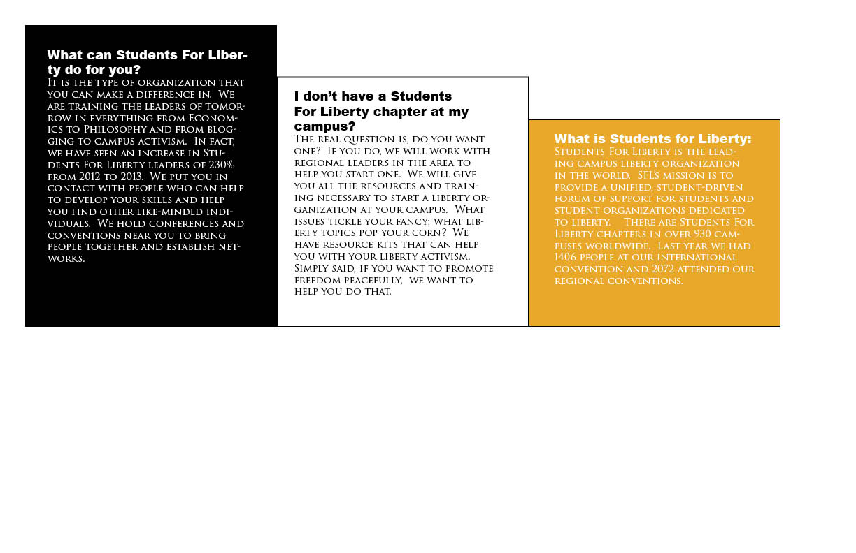
- Message: I wanted to do something that could be used.
- Audience: I want my audience to be anyone that would be interested in students for liberty literature.
- Top Thing Learned: I learned so much here. I don’t even know where to start. I learned about folds, alignment, brochure layout, the importance of In Design guidelines, etc.
- Color scheme and color names: I used black and white monochrome with a yellow accent contrast color.
- Title Font Name & Category: I used Ariel Black Sans
- Copy Font Name & Category: I used Tragen 3 old-style
- Word Count of copy: 300ish
- Thumbnails of Images used:


- Sources http://news.ucdavis.edu/photos_images/dateline_images/2013/091713/we_the_people_W2.jpg and the rest came from StudentsForLiberty.org

